
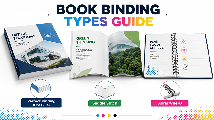
Printing Binding Types : Perfect Binding, Saddle Stitch, Wire-O
In the production of books, booklets, catalogues, company profiles, menus, manuals, notebooks and many other printed products, the binding method plays an important role in both appearance and functionality.Binding is not simply a way to hold pages together. The selected binding method can affect : The final appearance of the product.Strength and durability.How easily pages can be opened.The number of pages that can be bound.The type and thickness of paper that can be used.Production cost.Production speed.Whether the finished product looks economical, professional or premium.A binding method that works well for a thick catalogue may not be suitable for a notebook. Likewise, a binding method ...

Guide for Hot Foil Stamping and Embossing for Premium Print Finish
In the printing and finishing industry, some techniques are used not only to add color, but also to create texture, shine, depth and a premium appearance.Two of the most popular techniques for achieving these effects are Hot Foil Stamping and Embossing.These finishing methods are commonly used for products such as : Premium business cards.Sticker.Wedding invitations.Book covers.Certificates.Vouchers.Product labels.Hot Foil and Embossing have very different characteristics from standard digital or offset printing.Standard printing generally uses ink or toner, while Hot Foil and Embossing use a combination of dies, pressure, heat and finishing materials to create special effects on the surface...
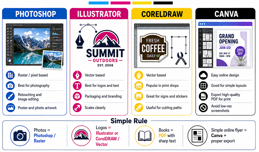
Choosing the Right File Type for Printing : Photoshop, Illustrator dan CorelDraw
One important part of preparing artwork for printing is choosing the correct file type and design workflow.Many customers assume that all design files will produce the same print quality as long as the artwork looks good on a computer screen.In reality, different design applications work in different ways, and different printing products require different types of artwork.A file that is ideal for printing photography may not be the best choice for a book containing large amounts of small text. Likewise, vector artwork that is excellent for logos and typography is not intended to replace high-resolution photography.Before sending artwork to a printing company, it is therefore important to und...
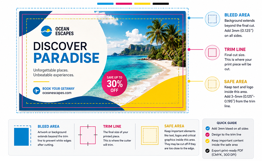
Bleed, Crop Marks and Safe Area Guide for Proper Print Design
When preparing artwork for printing, using the correct document size is not enough. Designers also need to understand bleed, crop marks, trim lines, and safe areas to make sure the final product still looks clean and professional after printing and cutting.One of the most common mistakes is creating artwork exactly at the final finished size without adding any extra area around the design.On a computer screen, the design may look perfectly aligned. However, after printing and trimming, several problems may appear, such as:White lines along the edge of the printed product.Background colors or images not reaching the edge.Text or logos positioned too close to the cutting area.Important design ...

CMYK Color Guide for Printing: Rich Black, Pure Black, Blue Colors, and Proper Color Settings
One of the most common problems in graphic design and printing is that printed colors often look different from what appears on a computer monitor or smartphone screen.For example, black may look less deep, blue may shift toward purple, gray may appear slightly brown, or bright colors on screen may look more muted when printed.These differences are normal because screens and printing machines use different color systems. However, with proper color settings from the beginning of the design process, these differences can be reduced significantly.In this guide, we will explain how to use CMYK colors correctly, including Pure Black, Rich Black, blue colors, Total Ink Coverage, ICC Profiles, and ...
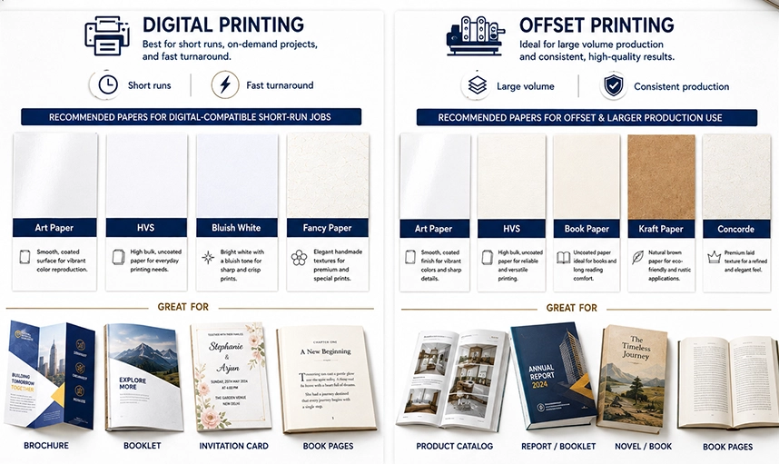
Printing Paper Guide : Art Paper, HVS, Concorde, Kraft & Book Paper